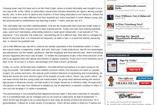
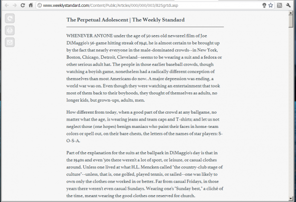
Though you may not know it, there’s a lot of stuff worth reading on the web.1 Unfortunately, unlike books or magazines, it can be kind of hard to read.
Take this screencap of an article on The Weekly Standard. All those flashy colors on the sidebar make it hard to concentrate, especially since your eyes hit them every time they get to the end of a line. And that’s just one thing in a pile of stuff that can make it hard to read. Ugly fonts, small fonts, crazy colors, flashing banners, and on it goes.
Fortunately, there’s a little tool that makes web reading a billion times2 easier. It’s called Readability.
Readability is a bookmarklet that strips away the extraneous elements of a page leaving you with nicely formatted content. Often, it will kill off the comments section, too (not a great loss on most public sites).
It’s also amazingly robust, extracting the content from almost any page I’ve wanted to throw at it (home pages and the like excepted, because it’s not designed for that).
Fret not, customization is easy. If, for some reason, you don’t enjoy reading medium size Athelas typeface with wide margins, change it: margins, typeface, size. Whatever you prefer. There’s even an option to convert links to footnotes, which is excellent for pages that look like a Wikipedia entry.
That’s it. No extra bells and whistles. In fact, it’s more like no bells and whistles. Which is awesome.
- Check out Longform.org for a place to start. ↩
- Approximation based on an average from five tests ↩


Comments are disabled for this post